Better font for LibreOffice and Linux
Please understand that I am no expert on font rederring, and this post is just a note for my future self in case I have to reinstall the whole system.
Today I had to open one .docx file in calibri font with LibreOffice Writer and notice that some characters of the text are blurry, especially at smaller sizes. It looked weird too; some of the characters are not spacing correctly, some are too far from each other, some just stick together. So I checked if I have the font calibri and it was there in the folder ~/.fonts.
I did two things and the result was unexpectedly-mind-blowing good, not only my document was displayed better in LibreOffice but also the font of the whole system was improved (Firefox, text in windows…):
(And I still did not know which has which effect!).
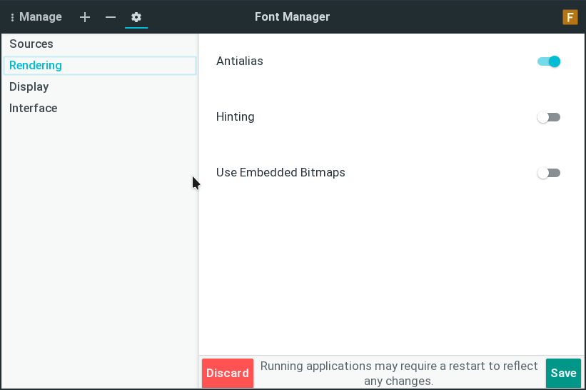
1. Use font-manager to turn on Antialias
If you have not had font-manager, use this command to install it: sudo apt install font-manager.
Then turn on Antialias.
2. Install Mac fonts:
I found an article here: “Calibri and Cambria fonts for Mac”
I download the fonts to replace the ones I copied from Windows.
I appreciate the author and the article so much!
Leave a comment